One of the many often overlooked things about your Ecommerce site that makes for a killer design is its typography.
Not only does it affect your site’s overall appearance, but it also makes for a good user experience for your site’s visitors or customers.
There are many types of fonts available today that you can use on your site, but not all of them work well together. That’s why you need to decide on the best set of font pairings you’ll apply to boost conversions and leave people wanting more.
Finding the right fonts for Ecommerce product descriptions isn’t an exact science. But, the rule of thumb is that you use opposites – font types with great visual contrast that work well together to make your product descriptions pop.
You can use color, weights, size, and classification attributes of the font you pick to create a set that adds texture and intrigue to your product descriptions.
In this guide, we’ll share 10 of the best fonts you can use for Ecommerce product descriptions to give people a good impression of your website and make it easier and pleasant for them to read.
Best Fonts For Ecommerce Product Descriptions
Your Ecommerce site demands fonts that reflect your brand’s identity and that are readable.
There are plenty of fonts you can pick from, but not all of them are suitable for your Ecommerce site’s product descriptions.
The best part is you can mix up fonts as long as they go well together on your site, so your home page can have a particular font type while your product descriptions have a different, but complementary font.
We’ve rounded up our top 10 picks for the best fonts for Ecommerce product descriptions to help you pick one that works best for your site.
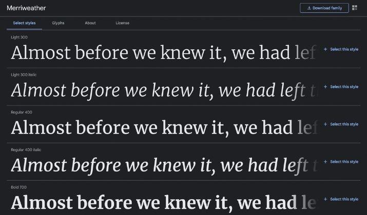
1. Merriweather
This serif font is developed for screens and can be read even at small sizes. Whether you leave it as a regular, italicize or bold weight, Merriweather maintains a sophisticated feel that shows your visitors your site is serious.
The font strikes the balance between simplicity and style and comes with plenty of styles you can pick from.
It also has a sans serif counterpart that works well with blogs or text-dense sites, and you can use it with your product descriptions. It pairs well with Roboto, Proxima Nova, Open Sans, and Avenir Next.
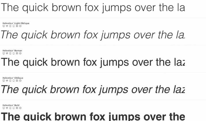
2. Helvetica
Helvetica is a very popular font owing to its over 100 variations, which makes it a versatile font to use. It’s been around since 1957 and has a modern, universal appeal.
The sans-serif font focuses on clean lines and shapes and is suitable for body copy including your product descriptions and headlines.
One of its variations is the Neue Helvetica, which is simple, easy to read, and works well in your copy – header and body text. It also comes with 128 different typefaces covering roman, light, condensed, outline, and other stylings.
Helvetica pairs well with Georgia, Lucida Grande, Roboto, and Gibson to create a clean and impactful website.
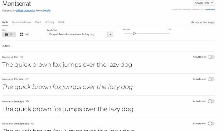
3. Montserrat
Montserrat is a geometric sans-serif font that you can use on your product descriptions and anywhere else on your site. The font has a bold and youthful aesthetic, which makes it popular among creative and digital agencies.
Plus, it scales well and can be read whether it’s small or large. The font was designed for fast reading and is distributed under an open-source license.
It pairs well with Lora, Open Sans, and Roboto Slab to create a cool and youthful vibe for your Ecommerce site.
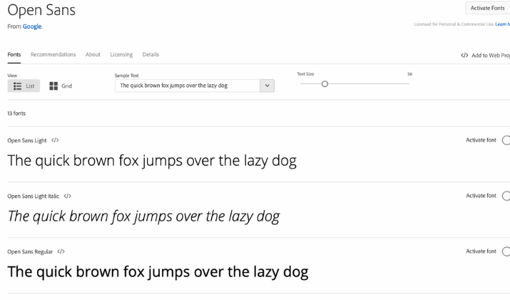
4. Open Sans
Open Sans is a sans-serif font that’s highly readable, minimalistic, and neutral. It’s also web-safe and works best for businesses that value quality control and reliability.
The font was designed by Steve Matteson and is good for reading even at small sizes, is optimized for mobile devices and the web, and is great for your product descriptions. It boasts an upright feel, with a neutral yet friendly appearance and open letterforms for versatility.
As a popularly used web font, the Open Sans has an incredibly strong and extensive library so you can substitute it for other sans-serif font typefaces on your site.
Open Sans pairs well with Roboto, Lato, Montserrat, and Brandon Grotesk to complement a monochrome and minimalistic aesthetic on your site’s design.
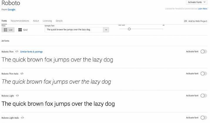
5. Roboto
Roboto is a sans-serif typeface also known as a neo-grotesque font, which gets its roots from Gothic origins. The enigmatic font is also geometric with open curves that deliver a professional and friendly mood.
The font has a techy, machine-like feel but it’s useful for preventing your site’s design from looking too clinical, especially if it’s a clean and minimalistic design.
Roboto pairs well with Lato, Open Sans, Roboto Slab, and Playfair Display.
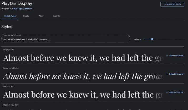
6. Playfair Display
Playfair Display is a serif font with a modern, elegant quality that comes with feminine undertones. The font is great for Ecommerce sites that target a female demographic thanks to its aesthetically pleasing and lightweight nature.
It also has different styles like the Playfair Display SC, which is strong and versatile, and you get subtle variations between the italic and standard lettering for your product descriptions. You can also get a version in lowercase characters.
The font was created by Eggers Sørensen and has a gentle yet traditional feel with a nice italic style. You also get classic letterforms with delicate hairlines and high contrast.
You can use Playfair Display to create a classic feel to your site, and use it with Georgia, Oswald, Arvo, Lato, Roboto, Montserrat, or Open Sans.
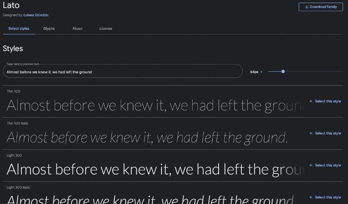
7. Lato
Lato is another sans-serif font that works well on different sites, even though it was created for corporate use. The font feels inviting and warm while displaying professionalism.
You can use it for your product descriptions and give your brand a friendly yet modern feel, regardless of the field.
The font was repurposed initially and given life as a popular typeface for web use.
It’s warm, clear, and strong, readable, and pairs nicely with other fonts such as Playfair Display, Open Sans, Roboto, and Montserrat.
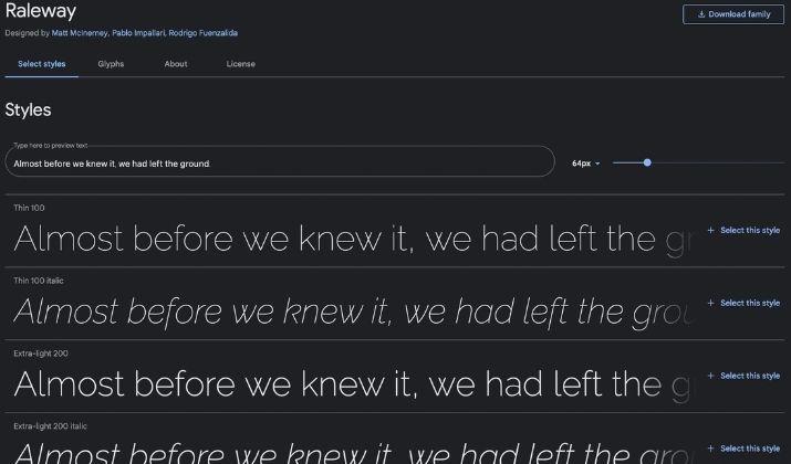
8. Raleway
Raleway was originally designed to be a single, thin-weight font. However, it has grown over the past decade to include nine weights, which range from thin to black.
The font comes with old-style features and an alternate style that converts Raleway into a geometric sans serif.
You can use it for your product descriptions thanks to its flexibility in terms of where and how you can use it.
The font was created by Matt McInerney but as a single thin weight. Later on in 2012, it was expanded by Rodrigo Fuenzalida and Pablo Impallari and iKerned by Igino Marini.
The display face font features both lining and old-style numerals, a comprehensive set of diacritics, with standard and discretionary ligatures. The open-source font has been expanded to cover more than 60 Cyrillic languages and over 105 Latin languages.
Plus, it comes in 18 weights including condensed styles in light, regular, semi-bold, bold, and extra-bold, as well as thin, light, regular, medium, black, and bold weights.
9. Avenir Next
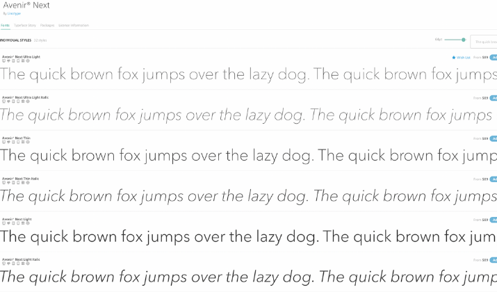
Avenir Next is a good font choice for product descriptions. Released in 1988, the font quickly became popular among the best sans-serif fonts that many people use for their website, graphic design, and web design projects.
At the time, it had already become an exquisite alternative to Avant-garde or Futura typefaces. It also had six weights at the beginning, which were decided on based on the increments in line thickness, but this proved to be a prescribing component in typographical practice when added to other formidable weights.
The font is available in four typeface units as part of the platinum Avenir series and parent design. It also comes in regular, condensed, condensed italic, and italic styles each with six one-of-a-kinds stem weights and genuine small caps with antique style figures.
Also included is the Avenir Next Pro, whose goal is to deliver a truly superior sans family.
Overall, the Avenir font family has a clean, straightforward design that works brilliantly for blocks of headlines and copy.
The font is also built for screen readability at any size together with heavyweights that pair well with other modern serif body types and make excellent display faces in their own right.
10. Times New Roman
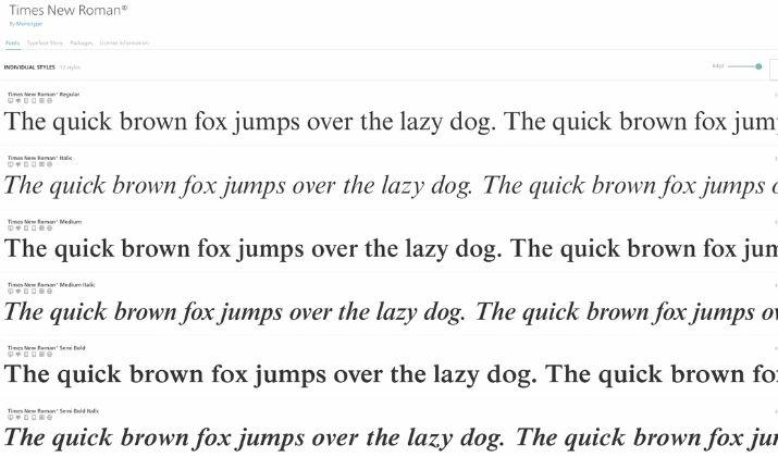
This is a classic popular font, which many designers may scoff at sometimes. However, it’s hard to go wrong with the age-old font.
It’s a serif font that’s readable, neutral, and has a timeless quality so it won’t go out of style. The typeface has been digitized and is one of the most legible and most recognizable on the web, having been used in big sites like Wayfair, Daily Mail, and others. It’s also web-safe, and you can install it across all devices.
You can use the classic and elegant font for your product designs and pair it with a bright color scheme to make it stand out.
How To Choose Fonts For Your Ecommerce Website Product Descriptions
When it comes to picking the right font for your Ecommerce product descriptions, there are several factors to consider so you’re sure you get the correct one. Here are some of these considerations:
Font type
Typefaces communicate different meanings and values that should align with your brand’s identity and overall message. Make sure the font is readable, web-safe, and legible so it can work across all devices and browsers for a better effect.
Font typographies include:
- Serif: Have the hook at the end of letters, tend to be read as traditional, have extra embellishments, and are easily readable in smaller copy
- Sans-serif: Don’t have the hook at the end of letters, tend to be read as modern, tend to be geometric and unadorned, and stand out in large, bold titles
- Script: Used for decorative purposes like writing headlines and pulling quotes; not good for long body text
- Display: Are large, eye-catching, and used for ads or headlines; not good with body copy or text smaller than 14 points
Scannability and readability
The font you pick should be easy to read and have good character spacing, color contrast, leading, and tracking. Ideally, you should use 14 to 16 points on the font you choose.
Information hierarchy
The hierarchy tells the reader which information to focus more on and the text that supports it. Put the larger font on top of the web page as your H1 heading, while H2s and H3s decrease in size clearly showing the information hierarchy.
Simplicity
Pick simple fonts that make it easy for your visitors to read and that are legible enough without affecting the overall design.
Mood
Some fonts are formal, classic, elegant, friendly, modern, or minimal. Check for fonts that match your design and bring out the mood you want it to portray.
Design psychology is built into typography and influences the mood you want to convey. For instance, sans-serif usually conveys trustworthiness, sophistication, straightforward, and innovation.
Wrapping Up
There are tens of thousands of fonts you can find to use online. However, narrowing down the choices to find the one that will fit your site perfectly can be a challenge.
Remember to aim to pair at least two for your site, so you can have a consistent look from the start and strengthen your brand’s recognizability.
Plus, it will encourage readers to focus only on what they read compared to marveling over all the different fonts on your product pages.
Now that you know what to look for, you need to decide on the font or typeface that works for your design and to your brand’s advantage.
